Productivity & Collaboration Tools Microsoft Office 365 Excel 365
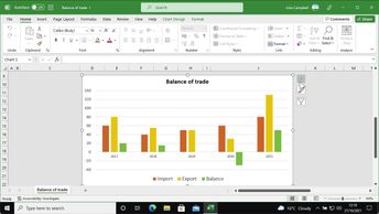
You can analyze and present your Excel 365 data in a more visually appealing way using Excel 365's various chart types. In this course, you will learn how to work with different chart types; and how to change a chart's appearance using the chart formatting tools. Next, you will learn how to customize individual chart elements, including customizing chart axes, moving or combining two types of chart, and customizing the chart's titles, labels, and axes. You will also explore how to insert and customize trendlines that can be used for data ranges, movements, or correlations; as well as how to add and modify Sparklines, which are at-a-glance visualizations.
| Objectives |
|---|
Excel 365: Customizing charts in Excel 365
|


