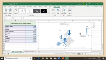
In this 6-video course, you will explore the variety of chart types and templates available in Excel for Office 365 to visually enhance the displayed data. First, learn how to insert, format, and manipulate charts, starting with a pie chart. You will then learn how to insert and use a scatter chart to analyze correlations and relationships between different data series. This course demonstrates the use of bubble charts to reference three different types of information in a single chart. Learners will examine how to use a radar chart to plot five different data values, and how to compare the form and size of the shape created along the five different axes to get an overall representation of the data series. You will learn to use a combo chart to create a graphic that combines multiple data types. Finally, when you have data relating to regions, countries, or other locations, you will learn how to use the map chart to plot values on a geographic display.
| Objectives |
|---|
Excel Office 365 (Windows): Working with Different Chart Styles
|