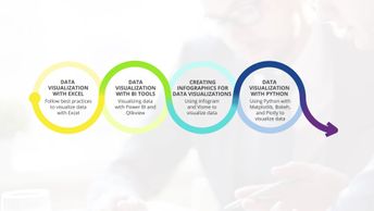
Aspire Data Visualization Mastery Data Visualization Track 4: Data Visualization with Python
Final Exam: Data Visualization with Python will test your knowledge and application of the topics presented throughout the Data Visualization with Python track of the Aspire Data Visualization Journey.
| Objectives |
Final Exam: Data Visualization with Python - create a Bokeh chart and save it as an html page and an image
- create a figure object with multiple axes objects and create line charts in the axes
- create exploded pie charts and treemaps
- create maps to visualize geographical data
- create various basic line charts visualizing random data using Matplotlib and pyplot
- display your visualization inline in a Jupyter notebook
- explore Matplotlib interactive back ends
- implement a scatter plot
- install and import Plotly using Jupyter notebooks
- install Matplotlib and explore Matplotlib interactive back ends
- interpret relationships using scatter plots
- use Jupyter notebooks to install and import Bokeh
- use Jupyter notebooks to install and import Plotly
- use Matplotlib to create exploded pie charts and treemaps
- use Matplotlib to create filled box-and-whisker plots
- use Matplotlib to visualize the relationship between two continuous variables using scatter plots
- use sunburst charts
- visualize a trend of a variable over time using a line chart
- visualize hierarchical categories using sunburst charts
- visualize statistical data using box-and-whisker plots
|